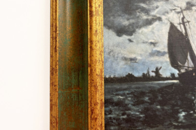
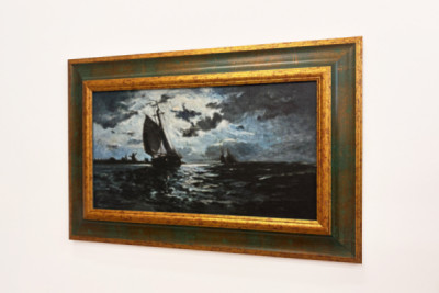
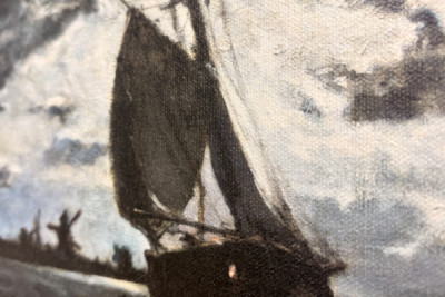
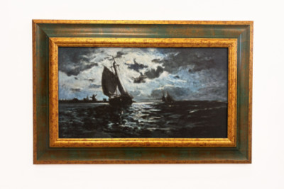
Against a starry night sky, a sailing ship glides across dark water. Its black sails stand out against a patch of bright clouds, through which the moonlight shines only dimly. A second, smaller silhouette appears on the horizon to the right; to the left, low-rise buildings and windmill-like structures mark the coastline. On the waves, the light breaks up into short white and blue-grey streaks, whilst the foreground and edges of the picture remain almost black. The vast expanse of sky looms over the narrow stretch of sea, lending the voyage a sense of uncertainty without the scene veering into the dramatic. Paul Gauguin, a French artist of the late 19th century, composes the motif using large fields of light and shadow. The ship remains clearly discernible, even though it almost merges with the sea and the coast.
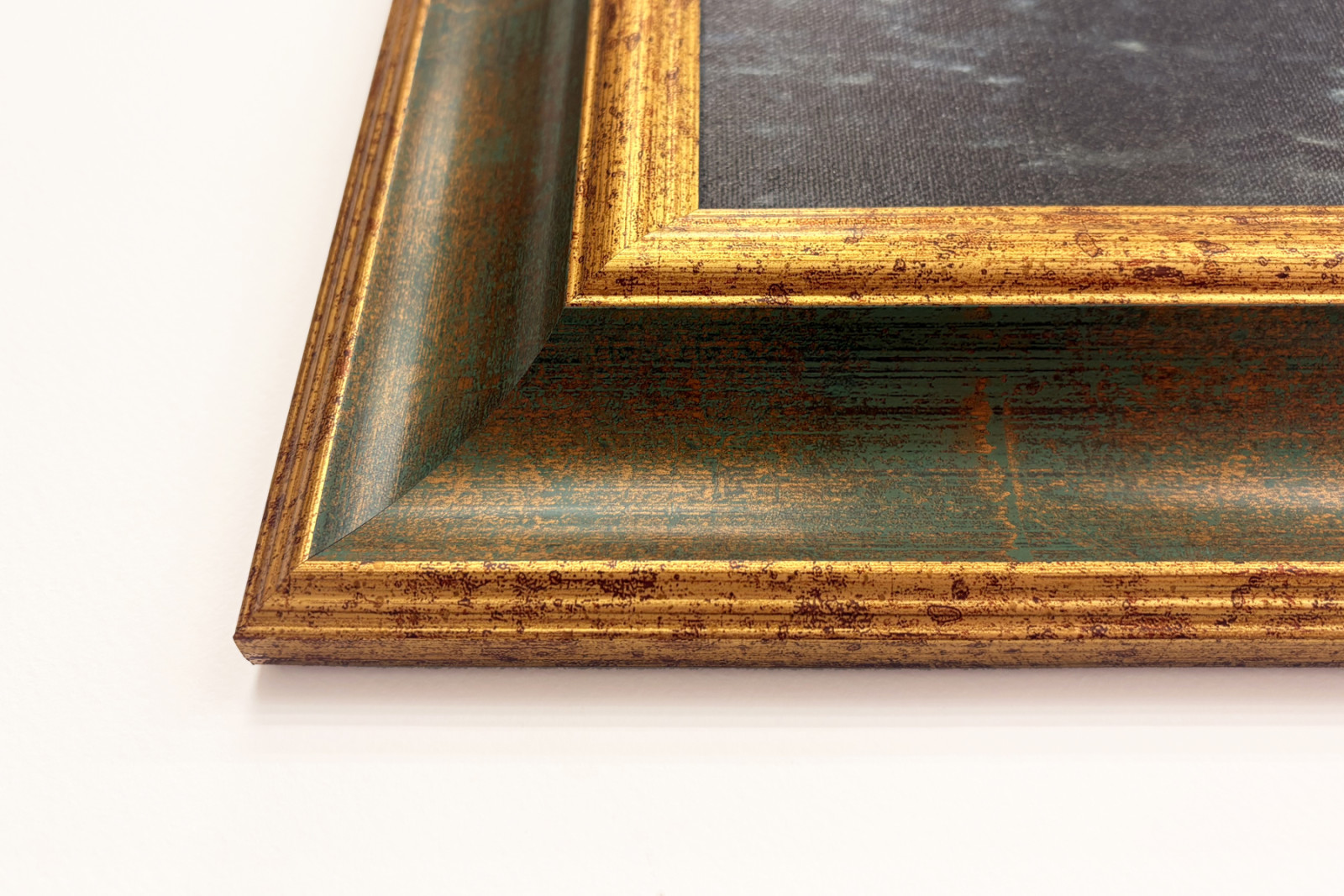
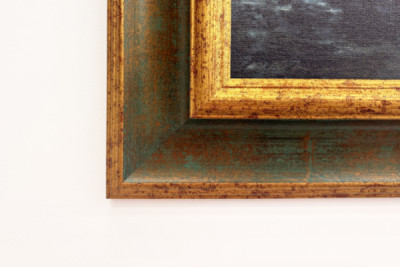
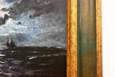
The work, executed on Leonardo (satin) canvas, sits directly against the inner gold edge of the ‘Lydia’ frame, without a passe-partout or glass. This is followed by the broad green of the wooden frame, whose golden grain runs across the surface in irregular streaks. One’s gaze is indeed drawn to such streaks whilst viewing the work - particularly in the bottom left-hand corner, where the interplay of colours becomes apparent: next to the almost black water, the green appears deep and cool; the brown-gold patches simultaneously lead to the pale streaks of light on the waves. The inner gold border draws a warm boundary around the blue-grey motif, thereby sharpening the ship’s dark silhouette. Above the pale expanse of clouds, the same shade of gold appears more vivid than at the bottom edge of the picture, where the sea and the frame are closer in colour.
The gold contrasts the cool moonlight with warmth, whilst the green complements the dark tones of the sea. For me, it is precisely this interplay of proximity and contrast that makes the combination so compelling - the picture and the frame are actually in dialogue with one another here, rather than simply existing side by side.
 ×






 +43 4257 29415
 support@meisterdrucke.com
 Mo-Do: 7:00 - 16:00 | Fr: 7:00 - 13:00